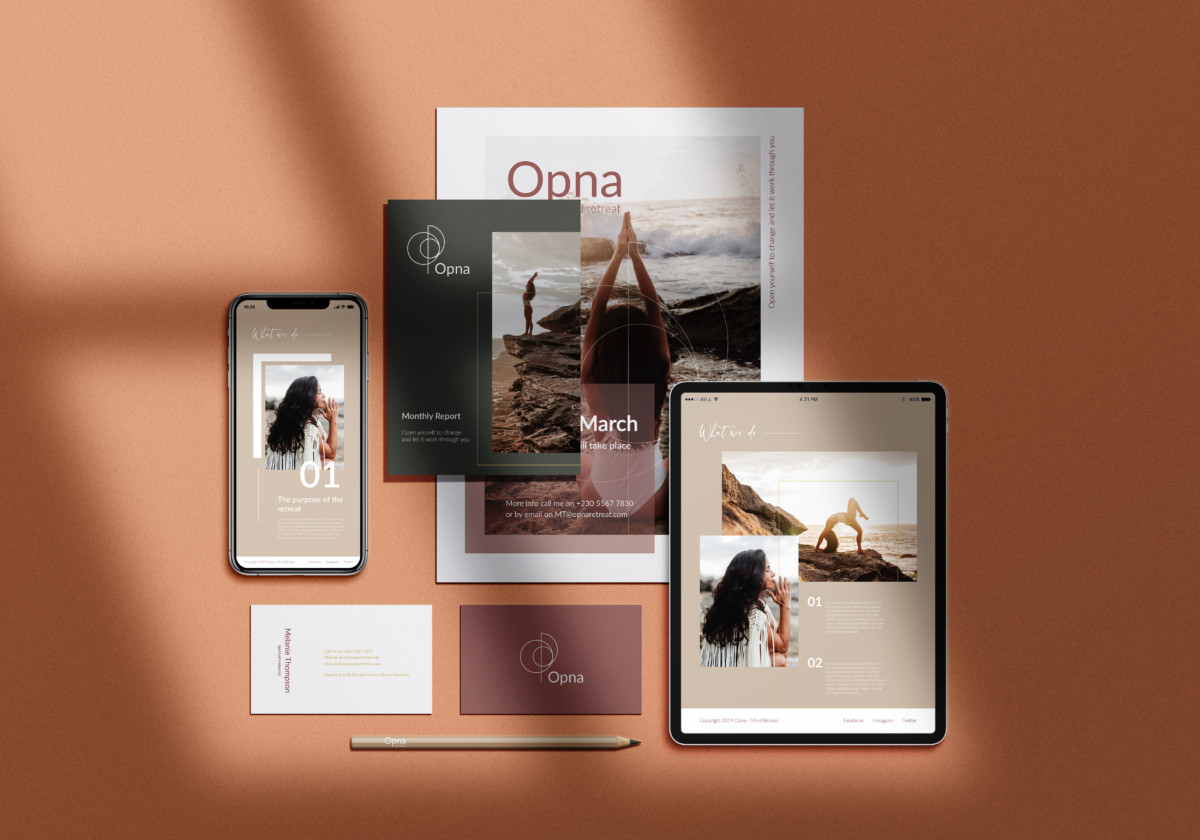
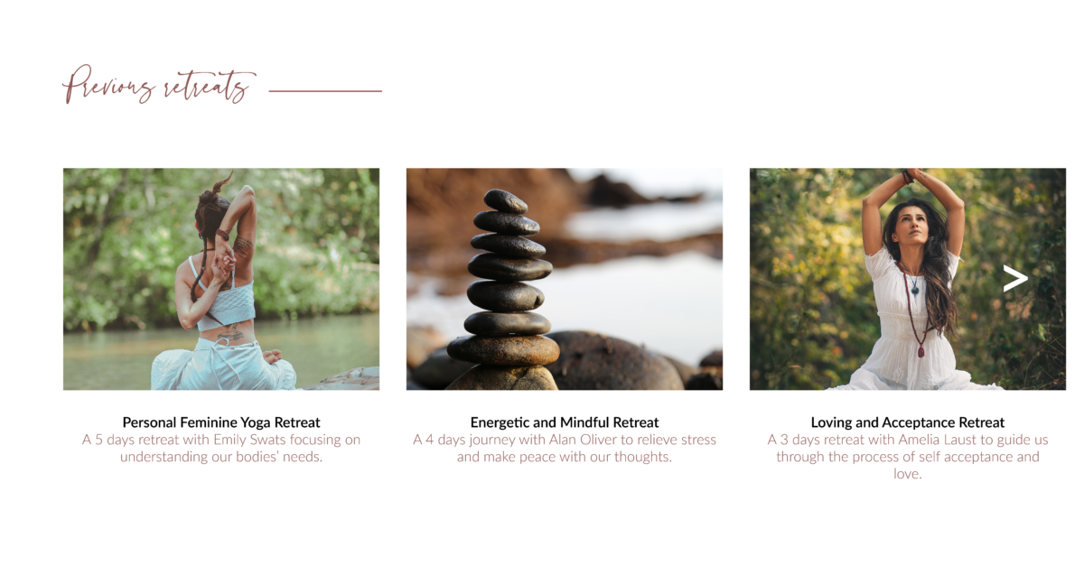
Through Opna Retreat Brand Identity, emphasis was on typography and attention to detail, but mostly on conveying this calming and safe place to release and express one’s emotions. Hence, I went for a pastel colour palette accompanied by relaxing and strengthening imageries.
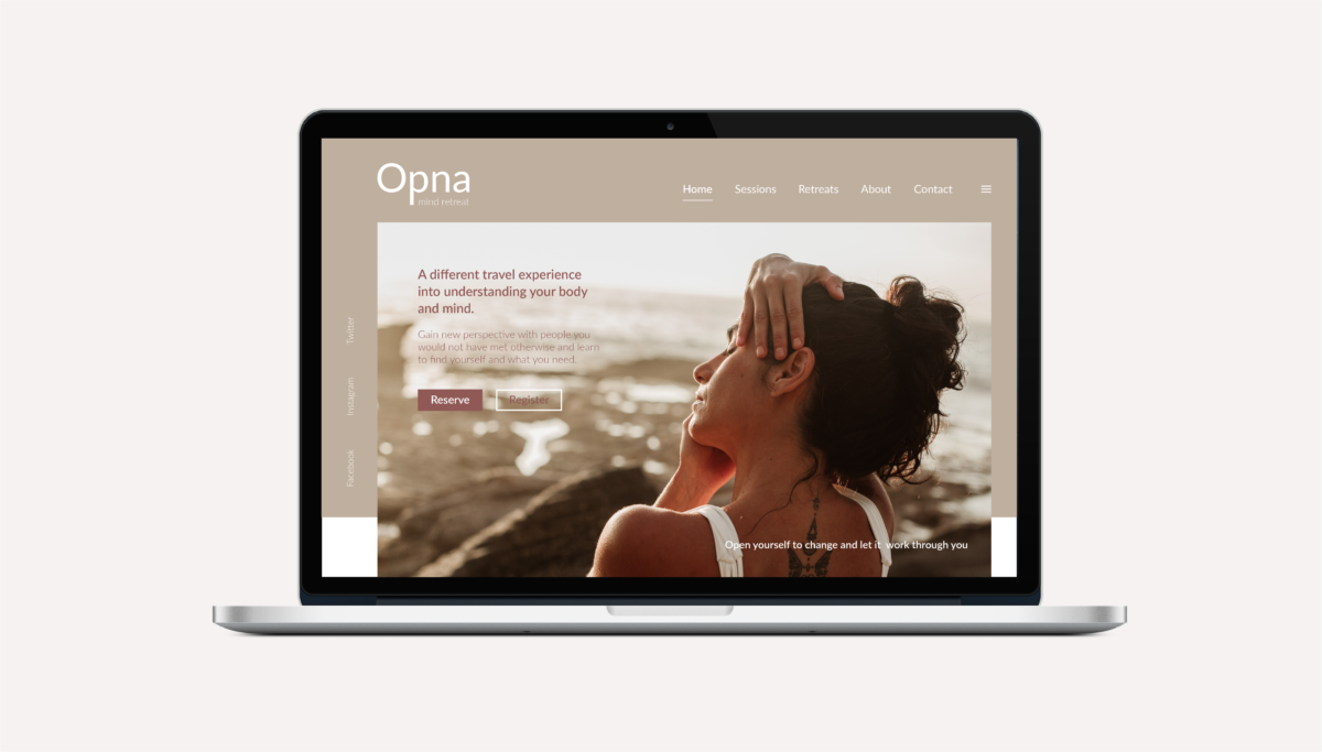
Website Curtain Slider
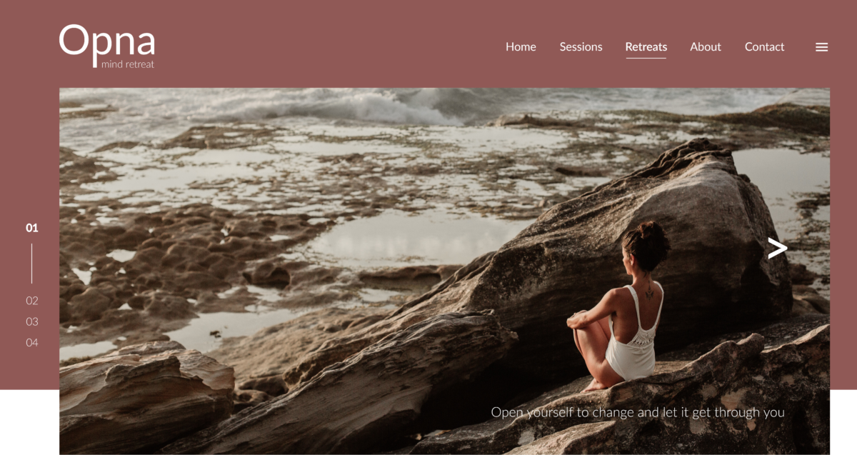
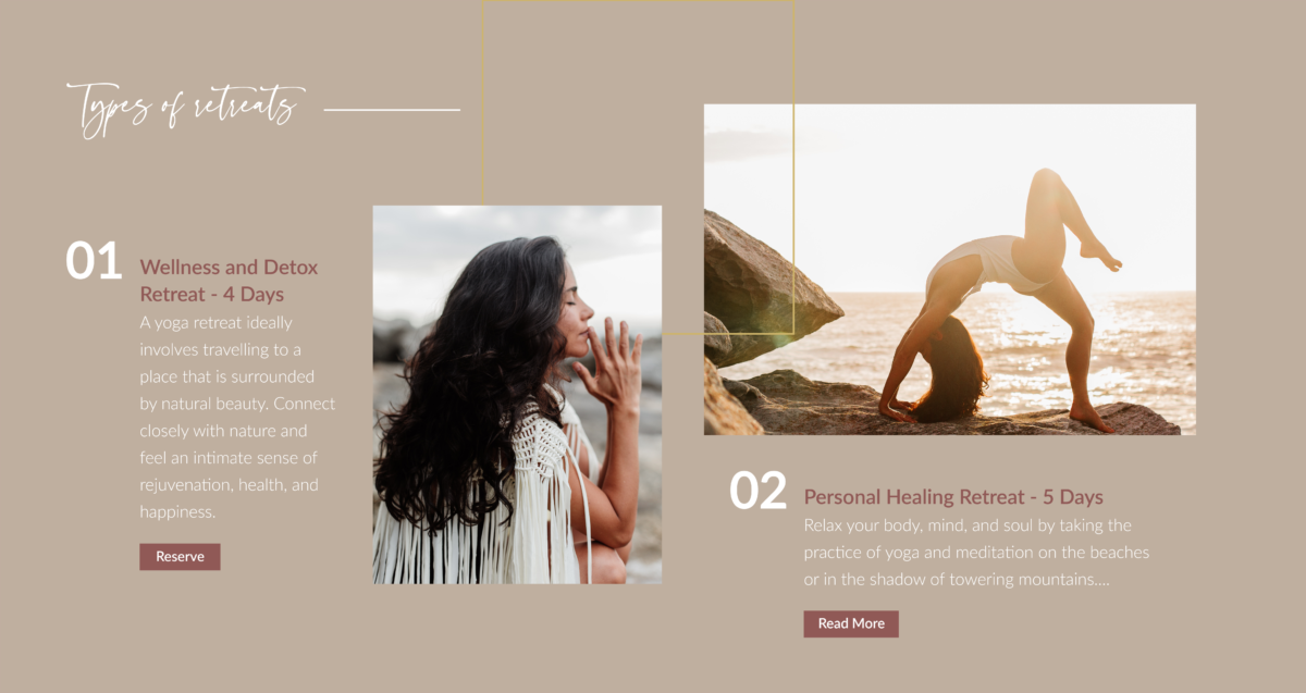
Brand Identity
